Warm surfaces
Orange sits between cream and brown, adding emphasis to a gentle palette.
Godbalo design language
Warm surfaces, clear information. Explore the colors, type and small interactions that bring a consistent character to the Godbalo website.
Explore the designOrange sits between cream and brown, adding emphasis to a gentle palette.
Information order, type size and weight help make the next step easy to find.
Space and curved photographs give the page a rhythm, with room to focus on one idea.
Foundations
Different pages tell different stories, with a shared foundation of color and type.
Select a color to explore its role.
The foundation that gives text and photography room to breathe.
Type for reading and type for expression each have a role.
At your pace. With clarity.
Pretendard carries body text and guidance. Size and weight establish the reading order.
Your own rhythm.
Bodoni and Didot-style serifs bring contrast to English accents, paired with generous space.
Components
BaroUI brings together the buttons, icons, navigation and dialogs used across the website. Choose a component below to see its live example, variants and usage.
Usage refers to clinic and information pages, excluding demonstrations in this catalog.
In practice
See how one design language works with different kinds of information.

A large heading, a portrait and generous space introduce the clinic.
Visit the page
Treatment imagery, programs and prices follow a consistent structure.
Visit the page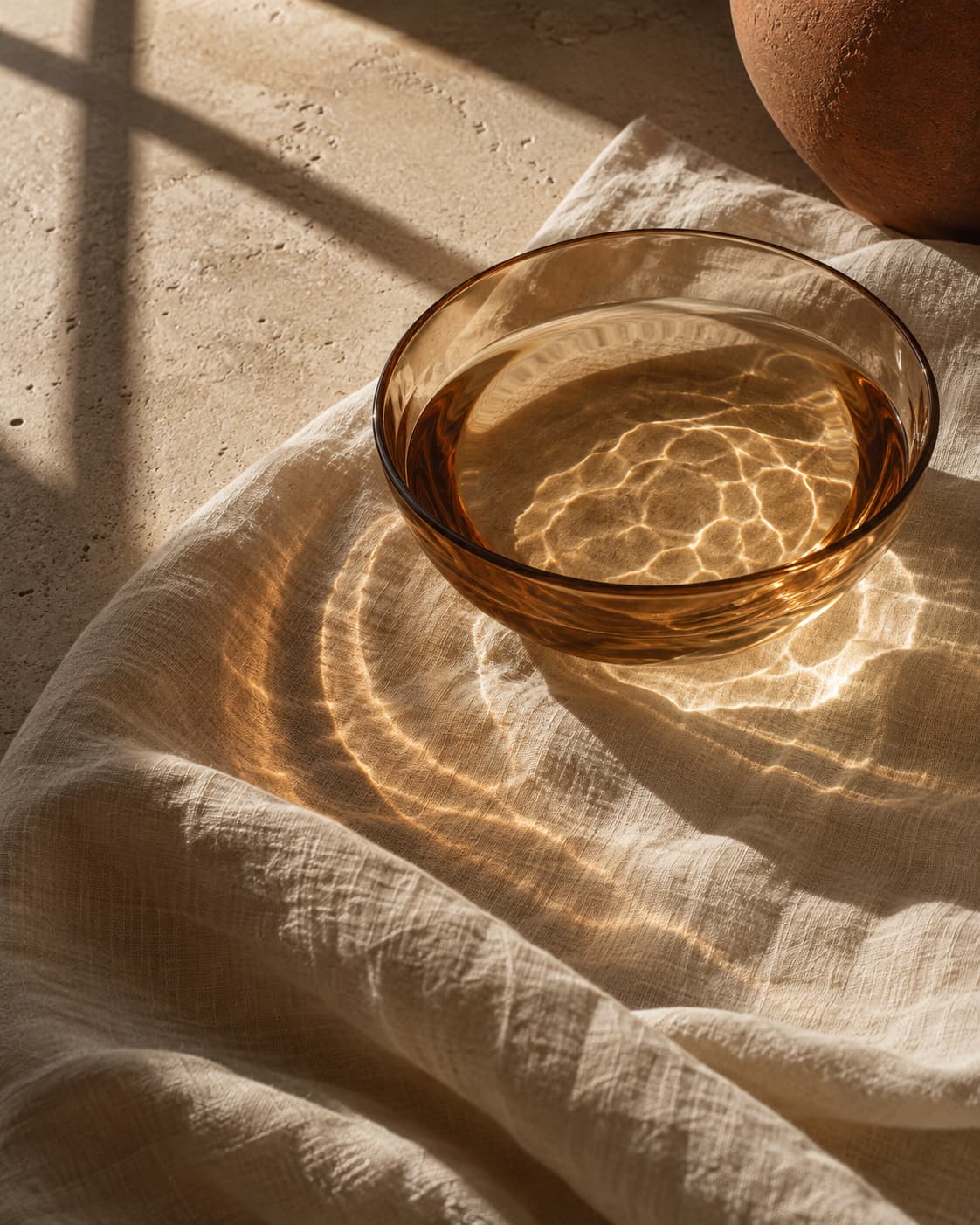
Navigation and text sit side by side, making guidance easy to find again.
Visit the page